Project Description
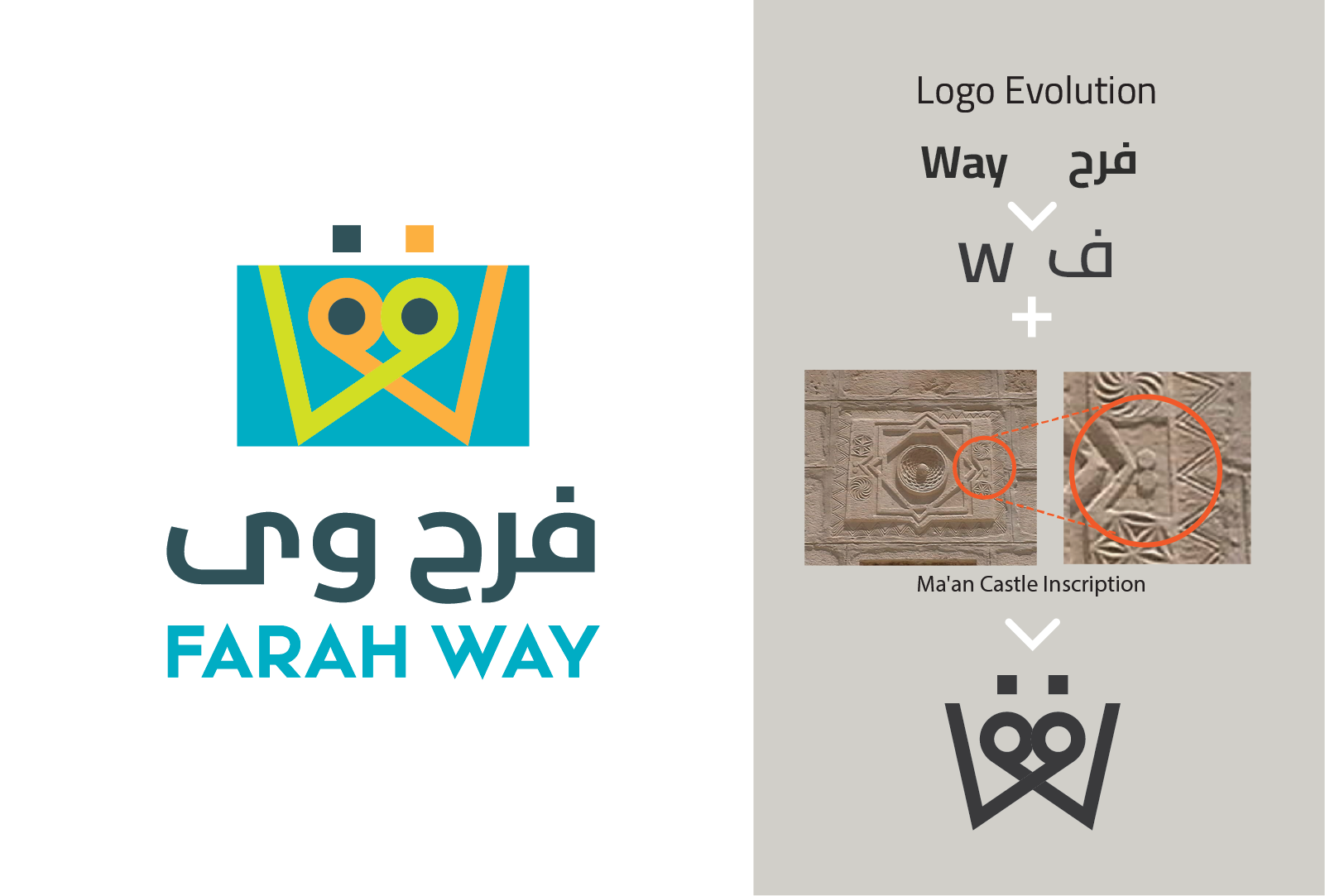
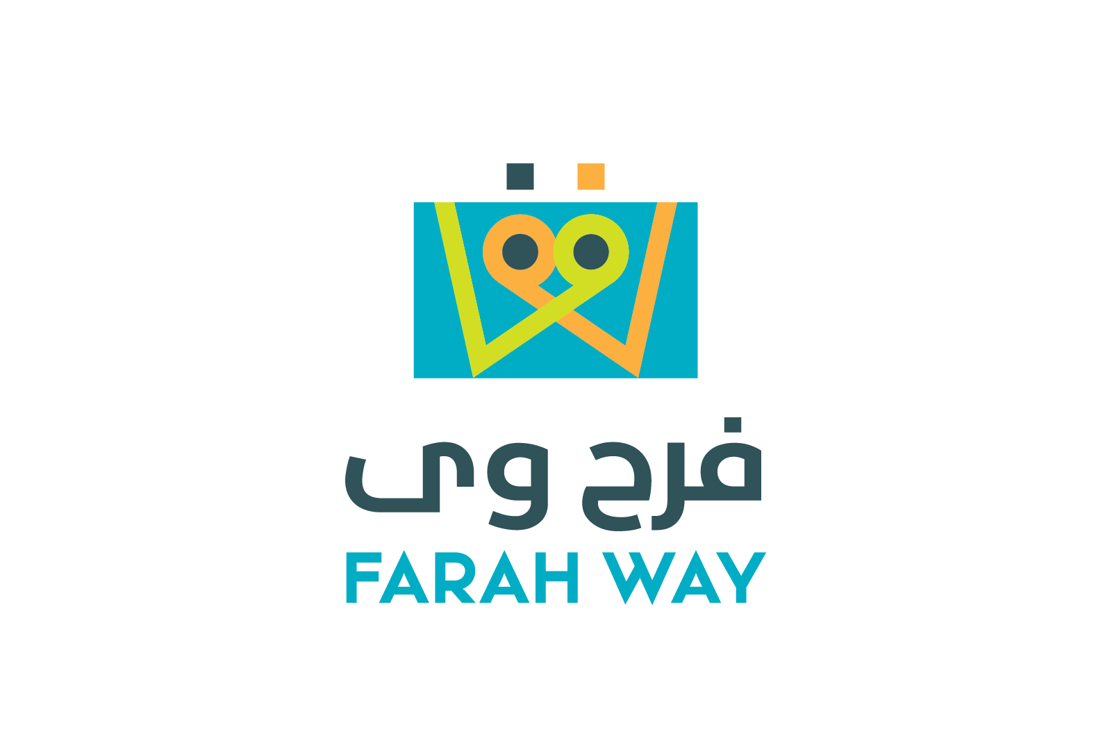
This fast food restaurant chain’s name Farah Way old logo was written in Arabic lettering only. While the first part of the name ‘Farah’ is clear to the consumer, the second half of the name ‘Way’ was not clear. In designing the new logo we decided that it should include full names in be in both Arabic and English for clarity.
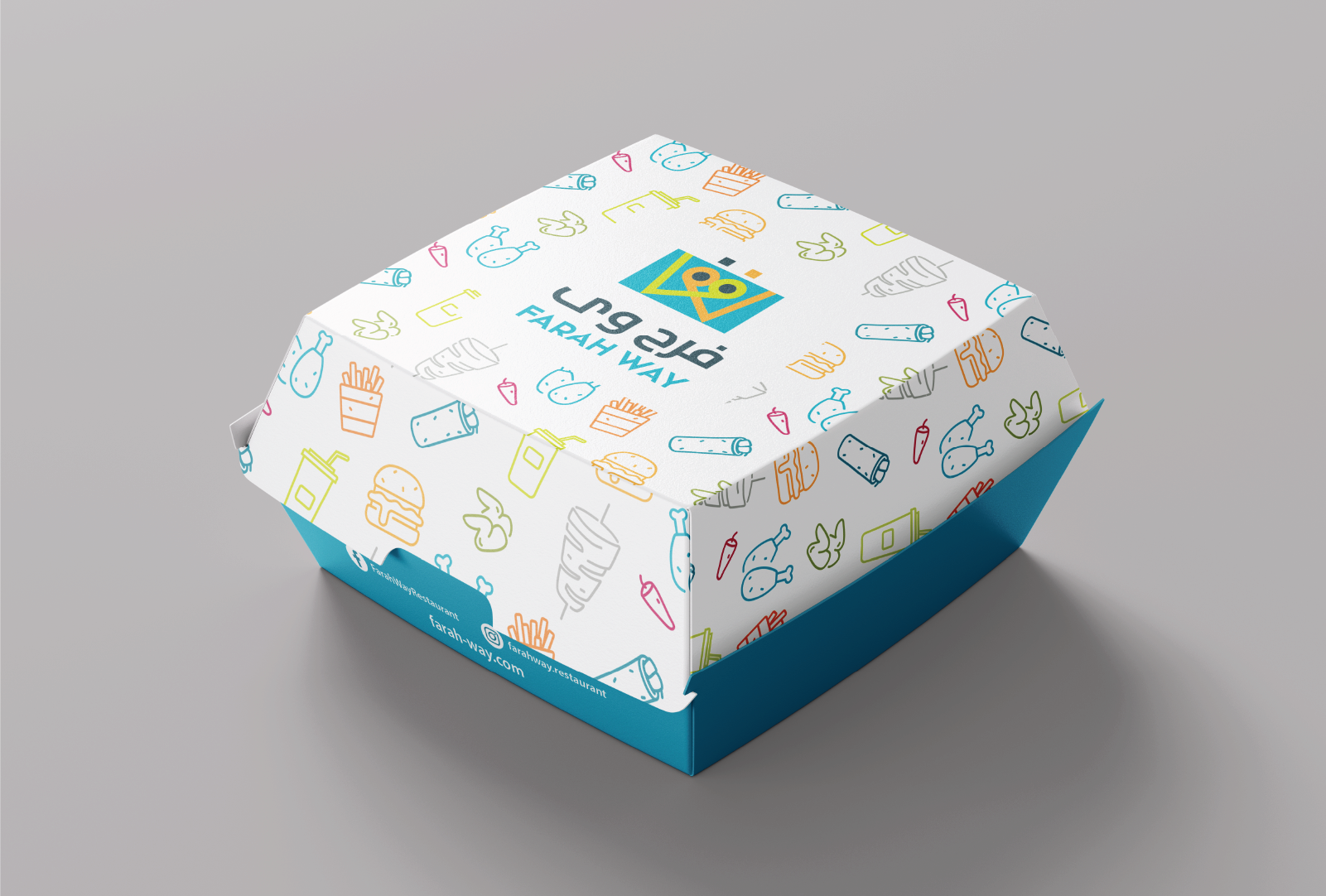
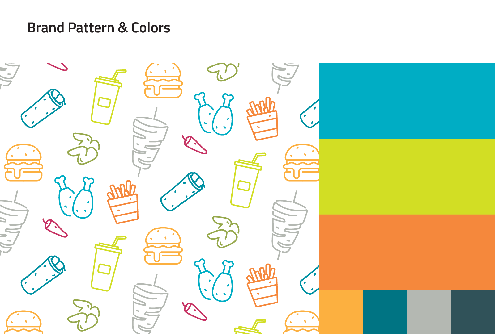
We also went back to the roots of this restaurant chain which started as a shawerma place in Ma’an (a historic city in the south of Jordan). We were inspired by an interesting inscription in the iconic Ma’an Castle which corresponded to our vision of the new logo combining the Arabic letter ف with the English letter W. The new logo is now rooted in history as well as being true to the correct language/lettering of its Anglo-Arabic name. When designing the brand we broke away from its old coloring scheme and created a fresh color palette with icons and patterns that represent its offerings.


